Showing posts with label Will Eisner. Show all posts

Wednesday, February 1, 2012

32 - Eisner / Kubert: Variations on a Visual Theme


It’s a safe bet that my awareness of the tensions of the times in 1955 has an overarching influence on my comparative reaction to the Eisner version. His four characters seem to me to be static, staid, and constrained. A bit more movement is sensed with Joe’s group, especially with the hoe-down fiddle stance that Kubert gave to Half-Mast, as compared to the concert hall pose that Will provided for him.

—p.e.f.

Taking on Will's 1955 cover was a challenge I had no choice but to accept. The PS editorial staff at Redstone Arsenal gave an order, and that was that.

I set out not to copy Will's drawing style, but to get the sense of warmth (despite the wintry snow) and animation that he achieved. The humanness of the characters. The life-like qualities that master cartoonist could convey.

I borrowed the layout and the composition and went to work. The result only made me appreciate all the more the abilities of the guy who did it all, over fifty years ago.

—j.k.


UPCOMING POSTINGS:

¶ Video: Joe Kubert at PS 60th Anniversary Celebration

¶ Video: Colonel ‘Pat’ Sullivan, Head of PS’s Home Command

¶ Video: Lieutenant General Via Salutes PS Program

¶ Video: Fitz Tells About Early PS, ‘Back in the Day’

¶ Best of PS by Perspective Instructional Communications

¶ Joe Dope Meets Beetle Bailey in PS

¶ A Covey of Connies—World War II to Today

¶ Wrap-Up: A Wonderful Year of Celebration

We initiated this blog, The Best of PS Magazine 1951-2011, in February of 2011, promising you a “year-long salute” to PS during its Sixtieth Anniversary Year. We hope to fulfill that pledge by completing presentation of the projected postings listed above, prior to the end of March 2012.


Wednesday, September 14, 2011

27 – Early Covers Plopped Eisner and PS in Hot Water

Despite the six-year sabbatical that had been in play since the end of World War II in 1945, when Will Eisner shuffled through his memories of Connie Rodd and Joe Dope in the spring of 1951 it seemed like business as usual at the same old stand—except that the name of the stand had been changed fromArmy Motors to PS Magazine. It turned out to be an illusion, though.

The peacetime interval preceding the Korean War had seen a mass exodus of victorious, battle-hardened warriors. In the world of military logistics, where PSwas based, many management-level functions had been filled, to an increasing degree, by civilians. It took some time for the light to dawn on Eisner and the initial PS staff, but a heightened presence of socio-political sensitivities had replaced the successful raw instincts that had worked so well during the Big One.


The criticism focused on Connie and Joe, plus Joe’s foil—Fosgnoff.

There were four general hoo-ha categories: feminine attire/dimensions; unmilitary appearance; unmilitary actions; and, Poor Taste. Will batted 1.000 after PS 1 (June 1951) and continuing through PS 13 (July 1953) drawing fire from one or more directions with every one. He pleased everybody with an anthropomorphic M-41 Walker Bulldog tank on the Front Cover of PS 14 (August 1953), but fell back into his outrage streak with PS 15 (July 1953) andPS 16 (January 1954), followed by PS 20 (May 1954) and PS 26 (November 1954) registering high on the thunder-and-lightning meter.

We’re going to present sixteen Front Covers here, in numeric/chronological order, beginning above, with PS 2 (July 1951) and picking up with PS 3 (August 1951), below, leaving it to you to assign the fault category (or categories) involved. There was a lot of overlap, especially when Connie and Joe appeared on the same Front Cover.


PS 4 (September 1951), above, with Connie washing garments in a stream was a favorite with the troops, but not with the Brass.


PS 5 (October 1951), above, with dueling fantasies of Connie and Joe in a hurtling Jeep was something of a rework or an Army Motors Front Cover with Joe alone in a similar situation.


PS 6 (November 1951), above, with Connie and Joe in a close-up, under a vehicle, speaks for itself.


PS 7 (July 1952) finds Connie, Joe, and an outdoors bulletin board in the rain. Eisenshpritz, yet.


PS 8 (September 1952) positions Connie on a mountaintop, with hovering helicopters.


PS 9 (November 1952) has Joe and a buddy out of uniform amidst what might be construed as evidence of excessive firing to hit a target. The elevation of the gun reflects the issue’s (it turned out) extremely controversial article about addressing “high angle cant.” The weapons-design boys howled that “there ain’t no such thing” and the red-legged cannon-cockers firing the guns responded: “The hell you say!”


PS 10 (January 1953) insinuates the “crime” of “cannibalizing parts).


PS 11 (March 1953) calibrates the vicissitudes of Korean winters as related to alloy simian statuary.


PS 12 (May 1953) plays off the fact that there really was a segment of mountainous Korean terrain that the troops called “Jane Russell.” Donald K. Hubbard always said that this was his favorite PS Front Cover. Hubbard came on board PS as a writer in July of 1954, became managing editor in October of 1963, and succeeded James R. Kidd as Editor in January of 1983. He retired in November of 1991.


PS 13 (July 1953) is something of a sophomoric reach combining a weak pun with a common vulgarity regarding extremely dire circumstances and a missing means of propulsion.


PS 15 (October 1953) reflects a shorthand vulgarism for constructive criticism resulting from a meeting with a displeased supervisor.


PS 16 (January 1954) was a little late, but it’s the thought that counts. Merry Christmas!


PS 20 (May 1954) really offended Joe Dope’s dedicated critics. Joe was the subject of a major rehabilitation campaign that lasted several decades and included a weapons mishap (due to poor preventive maintenance) that required extensive cosmetic facial surgery. His jacket was too heavy, though, and eventually he was eased back into civilian life.


PS 26 (November 1954) had one of the better first-glance, purely graphic Front Covers. The fact that it became a classic with Safety Officers (both civilian and military) did not deter the Pecksniffian Connie critics from complaining about the ratio of attire-to-exposure.

—p.e.f.


"Oh my lord, how the world has changed!"

Time was when funny was funny. And Will was the master of the genre.

Reviewing those old covers described as "questionable"; A) feminine attire, B) unmilitary appearance or action and C) poor taste is like saying guys in the Armed Forces were never interested in Betty Grable, Lana Turner, or (you name her). Three cheers for Will and four cheers for getting by the blue-nosed censors!

—j.k.

UPCOMING POSTINGS:

¶ Best of Zeke Zekely in PS

¶ A Covey of Connies: World War II to Today

¶ Best PS Continuity by Backes Group

¶ Runner-Up PS Continuity by Backes Group.

¶ Best of Perspective Instructional Communications in PS

Wednesday, August 3, 2011

23 – "PS Magazine" Saluted "Gunsmoke"—When Both Were Young


When the world was made aware of the June 3 death of actor James Arness, at the age of 88, I had a flashback to a sun-filled, early autumn evening in 1960, sitting beside Will Eisner aboard one of the early commercial jets, on our way to San Francisco and, ultimately, Korea.


We had looked down at Manhattan when the jet circled westward and talked about Will’s abiding affection for the Big Apple, with its (then) grime and hard shell. When that conversation lagged, I had asked him which PS episodes, if any, he had really enjoyed producing. The first one that he mentioned was Gunsmoke.


At the time of that conversation, PS 93 had just come off the presses. TheGunsmoke issue, PS 81, had been a year before, in August of 1959. The television version of the adventures of U.S. Marshal Matt Dillon premiered in 1955, and the PS tip-of-the-hat appeared during the show’s fourth year of its eventual 20-year run.


Eisner said that he had been a nominal fan of William Conrad’s radio version of the Dodge City drama but ratcheted his enthusiasm up a Stetson-full of notches with the visual aspects and dialogue touches that developed with the ensemble troupe that coalesced around Arness as the central character. “Arness’s ‘Matt Dillon’ speaks in sequential-panel balloons,” Will said.


Another facet of Eisner’s enjoyment in doing the PS 81 Gunsmoke thing derived from the manner in which PS Editor James R. Kidd restrained his staff from crowding the artist during its development. The project developed from a discussion during the late stages of a pencil-dummy review conference in the late spring of 1959 in the PS offices at Raritan Arsenal in Metuchen, New Jersey—about half-way between the program’s 1955 transfer out of Aberdeen Proving Ground, in Maryland, and its next move to Fort Knox, Kentucky, in 1952.


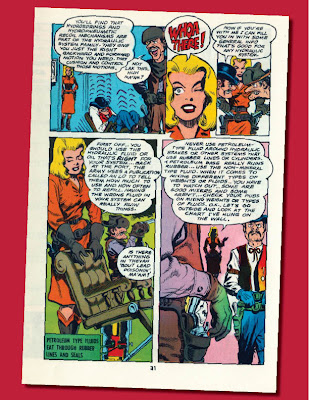
The idea developed from a rather spontaneous exchange, but rapidly deteriorated when a couple of aggressive staffers began to pepper Eisner with specific visual notions and demands. Without restraint, they would have been more than willing to tell him how to allocate a page—plus, write the balloons before the art. Kidd dialed things down, told them to back off, and later channeled them into the task of preparing a script of technical necessities regarding the general field of hydraulics, and preventive maintenance of hydraulic equipment. Far-fetched? Not when a mal-functioning barber-chair played a key role at a critical moment in the PS-notion of a Gunsmoke dramatic episode!


Eisner’s concept for the Front Cover beautifully invoked the classic Gunsmoke opening-shot.

At one point when Joe Kubert and I were at Redstone Arsenal recently for the official U. S. Army celebration of the PS Magazine Sixtieth Anniversary, we found ourselves in the neighborhood of a giant blow-up of that cover. I was engaged in a conversation with several people, but I could hear Joe, behind me, delivering to another small group a precise analysis of what Eisner had done—and why. I hope he will append those remarks to this blogpost.


For me, the Gunsmoke Front Cover and Continuity of PS 81 present a precisely perfect melding of an essential technical message with the communication potential of imaginative sequential art.

—p.e.f.


[The cover for] PS 81 is a perfect example of the cartoonist's use of composition and color to tell his story clearly with impact. A complex illustration that Will simplified by the use of orange and red, except for the foreground gunbelt and gunbutt and the background figure—where contrasting blues and whites were applied. In this way, Will accomplished two things: he created an additional depth to the illustration and caused the reader/viewer to focus on the cover's point. The gun in the holster (handle falling apart because of lack of maintenance) and the spider-web connected to the handle (again showing lack of current maintenance). It is abundantly clear that the man in the background is about to do away with the foreground character for those obvious reasons.

The cover also contains a building, horses tied to a hitching post, a deep background with two men running, a couple of guys peeking out of the saloon door and two more guys hiding under the porch and one more behind the horses. With all this stuff to flesh out an interesting drawing, Will knew that the main point should be noticed first, and that's the way he designed the cover. Good compositions and proper graphic communication is no accident. Like Will always said, "The best cartoonist is the thinking cartoonist

—j.k.


UPCOMING POSTINGS:

¶ A Covey of Connies: World War II to Today

¶ Best of Zeke Zekely in PS

PS Characters in Animation

¶ Early Covers Put Eisner, PS in Hot Water

Tuesday, June 14, 2011

18 – 'PS' and 4th Armored Division 1963 Event


Well into the somewhat aggressive European winter of 1962-63, I found myself in southern Germany, holed up in a modest-but-venerable hostelry in Göppingen with two United States Army bull colonels. The antiquated ambience was not marred by any modern notions, such as central heating.

Colonel William B. Latta was head of the Materiel and Maintenance Division in the Office of the Deputy Chief of Staff for Logistics. Colonel George C. Benjamin was the President of the U.S. Army Maintenance Board, located at Fort Knox.

Colonel Benjamin also was the new boss of PS Magazine. Our entire operation had been transferred to his command less than three months earlier—moved lock-stock-and-Connie Rodd—to Kentucky from Raritan Arsenal in New Jersey


We were in Göppingen to provide assistance to the nearby 4th Armored Division in planning for a Force Readiness and Maintenance Awareness program for the coming summer. At that point on the map and that point in time, this subject was high on the list of the 4th Armored’s priorities. It was based in strategic proximity to German’s borders with Austria and Czechoslovakia.

One of the fruits of our expedition’s labors fell into my lap, calling for a unit-specific publication, derived from PS archives. The PS staff pulled it together. Final touches, production, and distribution were handled by 4th Armored.

The result was a 16-page, self-cover, 5.5 x 8.5 booklet printed in black-plus one (red).

The original cover of PS 55 (April 1957), shown above, was, of course, in full-color. It was adapted to black-plus-spot red, shown below, followed by the selected PS spreads and a discussion of them.


The Back Cover, above, also originally was a full-color PS piece adapted as a duotone.

The two-page spreads shown here, all from Will Eisner’s shop, reflect a PS custom of the time in which most—but not all—issues carried a cross-gutter “message” spread on the Inside Front Cover and Page 1. A vertical index-panel occupied half of the right-hand page. The efforts to achieve a seamless art-flow across the two facing pages were, to a degree, thwarted from the git-go by the surface-difference between the cover-stock and interior-stock. Quality controls in imposition, printing, and folding operations provided another range of variables.

There is ample evidence here, though, of PS management’s encouragement of Eisner to break out of the columnar-text and rectangular-panel box. There are distinct feelings of space and movement that are surprising for such a small page. There is one especially subtle duotone. With sufficient imagination, one might even catch a whiff of smoke!

—p.e.f.


Y'gotta have guts, and Will Eisner had plenty of that. It's apparent from the examples shown that Will completely ignored the penalties of color (or lack thereof) and misprints of a double-page spread. He had ideas for design that would impact on his readers, maybe even drive them to read the text, provoked by these illustrations both eye-catching and entertaining. So what if they're off-register? Or the color (even the one-color) bleeds outside the outlined illustrations? It's the idea that counts, and nothing could stop Will Eisner's ideas

—j.k.

UPCOMING POSTINGS:

PS Sixtieth Anniversary Edition

¶ A Covey of Connie Covers

¶ Eisner Saluted Gunsmoke in PS

PS Sixtieth Anniversary Celebration

¶ Best of Zeke Zekely in PS


Thursday, May 26, 2011

16 - Warriors and Weather: Part D


We’ve uploaded fifteen graphic selections for this sixteenth BlogPost in our ongoing, year-long salute during this Sixtieth Anniversary Year of the U.S. Army’s internationally acclaimed preventive maintenance publication, PS Magazine. This presentation also is the final segment of a four-part series, Warriors and Weather, lifting up the singular adroitness developed by PS in its recognition and depiction of the challenges, conflicts, worries, and woes that inevitably occur when military tasks and operations are further confounded by the intrusion of season and climate.

Art and design by Murphy Anderson, Will Eisner, and Joe Kubert have been selected not only to exhibit true “weather” eyes and pens, but also to illustrate a discussion of some of the (then) innovative concepts and techniques, recognized and encouraged by the PS staff, and pursued, adapted, and expanded by the contract artists. The publication’s success derives from a delicate melding of mission objectives, technical accuracy, graphic possibilities, and artistic imaginations


One of the earlier issues fully dedicated to weather concerns, during the first decade of PS, was PS 120 which came off the presses in November of 1962, out of Will Eisner’s shop. Its focus was cold weather, and its mission was summarized in the main front-of-the-book spread, Inside Front Cover-Page 1, shown above.

You saw the PS 120 Front Cover, right, in full-size in our preceding BlogPost 15.


The planning for PS 120 began a year in advance. In mid-winter 1961-62, as Managing Editor, I found myself in Alaska and tasked with obtaining both climate and equipment photography for artists’ references, researching situational jargon, and developing a content wish-list from knowledgeable troops—on all rungs of the command-ladder. In the process, I also became aware of the ambiance in a tent at -45°.

Two more cold weather Front Covers by Will are shown below: PS 202 (September 1969) and PS 211 (June 1970), right.


Cold weather depictions by Joe Kubert, the current PS creative art and pre-press services contractor, as previously presented in this series, have displayed his utilization of the PS tradition of pushing the graphic envelope, plus an imaginative enhancement building on it. Joe marked his tenth anniversary with PS this past February.

Joe’s page design above is the Inside Front Cover from PS 627 (February 2005). The one below is Page 2 from PS 696 (November 2010).


Murphy Anderson is a seasoned veteran of PS artistic endeavors at many levels, stretching across two decades, from a hired-pen in Eisner’s shop, through the time of “The Eisner Alumni Group,” and his own nearly ten years as The Man. It has been said—purely in jest, I’m sure—that the only three people in the world who could distinguish between inking by Will Eisner, Mike Ploog, and Murphy Anderson were—Eisner, Ploog, and Anderson.

In our immediately preceding BlogPost 15, we introduced you to Murphy’s PS 323 (October 1979) as another example of a complete issue devoted to cold weather concerns. In that posting, we showed you the Front Cover and Continuity.

Our selection of Murphy’s art for this specific presentation consists solely of two-color, interior, pages from the same issue. The purpose is to display the presence of evolved graphic threads of two-color design, creative use of Ben-Day (benday, if you prefer) screen values, melding of text and art, utilization of every square-centimeter of “real estate,” and a pronounced aversion to templates. This discussion will be continued below.

From PS 323, they are: Pages 4-5, above; and, below, in this order, Pages 58-59, 60-61, 54-55, 10-11, and 6-7. BTW: The “yellow” on Pages 60-61 was not there when they came off the press, but probably were given this “authenticating enhancement” by some ranking NCO with a highlighter.


Beginning with the page displayed above, and continuing below, some less-frigid focus on weather is provided by this Continuity that Will Eisner did for PS 113 (April 1962). The two pages that are not shown here were used for the centerspread-miniposter that addressed an unrelated subject.


Considering the known lead-time involved in the four-color elements of PS, it is interesting to note the locale (Glob Island) involved in this sequence. Will probably started the roughs for it not too long after he and I returned from a PS research trip to Asia and the Pacific Basin.

In those days, PS managers were encouraging Eisner to bend and break graphic design barriers regarding PS as effectively as he had those in the world of comics. Unfortunately, technology and economics were the jokers in the deck.

“Typographic ingenuity” was an oxymoron when the Linotype operator was king, “hot” type was the only game in town, and choice of fonts was something of a “vanilla, chocolate, or strawberry” proposition. Ninety-degree angles ruled. Anything other than miles and miles of rigid, straight columns was a stab in the wallet. Irregular measures and wraparounds were fantasies.

Color was something else, again. There was no arguing with the limitations codified by the formulaic charts of the “bogus” four-color separation system based on three fixed values each for C, M, and Y, and you had best stick to plain "solid" for K.

For spot color, which was the purely manual world of the PS two-color interior pages, it all came down to acetate overlays and hand-painted areas. Which meant multiple film shots, agonizing stripping, and multiple burns to plates. It was no wonder that Eisner approached apoplexy when we introduced the idea of duotone mixes of Ben-Day values

He came to like it.

I discussed several aspects of this evolution in my Will Eisner and PS Magazine.

—p.e.f.


Having worked in the medium of comic book reproduction, color and otherwise, no one can appreciate the sweat and vicissitudes Will Eisner, et al, experienced more than I.

Before the advent of the computer, if the components of green (yellow and blue) met less than a quarter of an inch apart, the color print was considered a success. Art corrections were done with razors, scissors and rubber cement. Balloons and sound effects were done by hand with pen, brush and ink. On top of all that, deadlines had to be met.

Gone are the rubber cement and the cut-out corrections. But Will cut a clear path that we can all follow!

—j.k.

UPCOMING BLOG POSTS—

¶ Early Covers Put Eisner, PS in Hot Water

¶ The Best of Zeke Zekely in PS

¶ A Covey of Connie Covers

¶ Perspective Instructional Communications' Best in PS

PS Art Contractors—60 Years of Dedication