Showing posts with label Murphy Anderson. Show all posts

Thursday, September 29, 2011

28 - Zeke Zekely's Best in PS Magazine


Zeke Zekely’s Sponsored Comics in Beverly Hills, California, held the PS contract for only six issues, PS 309 (August 1978) through PS 314 (January 1979). Zeke had obtained the contract by under-bidding Murphy Anderson, and Murphy was brought back in after Zekely’s default, resuming with PS 315 in February 1979 and continuing through PS 368 in July of 1983.

Under Zekely, the continuities were done by Dan Spiegle, who drew movie and television adaptations for Gold Key comics. “Think of titles such as Lassie,Fury, and The Misadventures of Merlin Jones,” PS Production Manager Stuart Henderson says.

The covers and two-color pages were done by Alfredo Alcala, who also drew a lot of the Conan comics for Marvel.

The New Millennium PS staff’s pick as Zekely’s Best Front Cover was on PS 309 (August 1978) showing Thor—reclining against a tree and being questioned by Connie and a soldier, and their choice as his Best Continuity was in the same issue: Famous FOD'ers [Foreign Objects Damage] of History.

The Front Cover is displayed above, the Centerspread Mini-Poster is shown below, and the Continuity follows, in order.

—p.e.f.


UPCOMING POSTINGS:

¶ A Covey of Connies: World War II to Today

¶ Best PS Continuity by Backes Group

¶ Runner-Up PS Continuity by Backes Group.

¶ Best of Perspective Instructional Communications in PS


Thursday, May 26, 2011

16 - Warriors and Weather: Part D


We’ve uploaded fifteen graphic selections for this sixteenth BlogPost in our ongoing, year-long salute during this Sixtieth Anniversary Year of the U.S. Army’s internationally acclaimed preventive maintenance publication, PS Magazine. This presentation also is the final segment of a four-part series, Warriors and Weather, lifting up the singular adroitness developed by PS in its recognition and depiction of the challenges, conflicts, worries, and woes that inevitably occur when military tasks and operations are further confounded by the intrusion of season and climate.

Art and design by Murphy Anderson, Will Eisner, and Joe Kubert have been selected not only to exhibit true “weather” eyes and pens, but also to illustrate a discussion of some of the (then) innovative concepts and techniques, recognized and encouraged by the PS staff, and pursued, adapted, and expanded by the contract artists. The publication’s success derives from a delicate melding of mission objectives, technical accuracy, graphic possibilities, and artistic imaginations


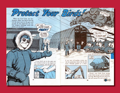
One of the earlier issues fully dedicated to weather concerns, during the first decade of PS, was PS 120 which came off the presses in November of 1962, out of Will Eisner’s shop. Its focus was cold weather, and its mission was summarized in the main front-of-the-book spread, Inside Front Cover-Page 1, shown above.

You saw the PS 120 Front Cover, right, in full-size in our preceding BlogPost 15.


The planning for PS 120 began a year in advance. In mid-winter 1961-62, as Managing Editor, I found myself in Alaska and tasked with obtaining both climate and equipment photography for artists’ references, researching situational jargon, and developing a content wish-list from knowledgeable troops—on all rungs of the command-ladder. In the process, I also became aware of the ambiance in a tent at -45°.

Two more cold weather Front Covers by Will are shown below: PS 202 (September 1969) and PS 211 (June 1970), right.


Cold weather depictions by Joe Kubert, the current PS creative art and pre-press services contractor, as previously presented in this series, have displayed his utilization of the PS tradition of pushing the graphic envelope, plus an imaginative enhancement building on it. Joe marked his tenth anniversary with PS this past February.

Joe’s page design above is the Inside Front Cover from PS 627 (February 2005). The one below is Page 2 from PS 696 (November 2010).


Murphy Anderson is a seasoned veteran of PS artistic endeavors at many levels, stretching across two decades, from a hired-pen in Eisner’s shop, through the time of “The Eisner Alumni Group,” and his own nearly ten years as The Man. It has been said—purely in jest, I’m sure—that the only three people in the world who could distinguish between inking by Will Eisner, Mike Ploog, and Murphy Anderson were—Eisner, Ploog, and Anderson.

In our immediately preceding BlogPost 15, we introduced you to Murphy’s PS 323 (October 1979) as another example of a complete issue devoted to cold weather concerns. In that posting, we showed you the Front Cover and Continuity.

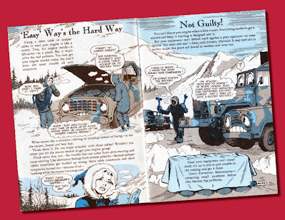
Our selection of Murphy’s art for this specific presentation consists solely of two-color, interior, pages from the same issue. The purpose is to display the presence of evolved graphic threads of two-color design, creative use of Ben-Day (benday, if you prefer) screen values, melding of text and art, utilization of every square-centimeter of “real estate,” and a pronounced aversion to templates. This discussion will be continued below.

From PS 323, they are: Pages 4-5, above; and, below, in this order, Pages 58-59, 60-61, 54-55, 10-11, and 6-7. BTW: The “yellow” on Pages 60-61 was not there when they came off the press, but probably were given this “authenticating enhancement” by some ranking NCO with a highlighter.




Beginning with the page displayed above, and continuing below, some less-frigid focus on weather is provided by this Continuity that Will Eisner did for PS 113 (April 1962). The two pages that are not shown here were used for the centerspread-miniposter that addressed an unrelated subject.


Considering the known lead-time involved in the four-color elements of PS, it is interesting to note the locale (Glob Island) involved in this sequence. Will probably started the roughs for it not too long after he and I returned from a PS research trip to Asia and the Pacific Basin.

In those days, PS managers were encouraging Eisner to bend and break graphic design barriers regarding PS as effectively as he had those in the world of comics. Unfortunately, technology and economics were the jokers in the deck.

“Typographic ingenuity” was an oxymoron when the Linotype operator was king, “hot” type was the only game in town, and choice of fonts was something of a “vanilla, chocolate, or strawberry” proposition. Ninety-degree angles ruled. Anything other than miles and miles of rigid, straight columns was a stab in the wallet. Irregular measures and wraparounds were fantasies.

Color was something else, again. There was no arguing with the limitations codified by the formulaic charts of the “bogus” four-color separation system based on three fixed values each for C, M, and Y, and you had best stick to plain "solid" for K.

For spot color, which was the purely manual world of the PS two-color interior pages, it all came down to acetate overlays and hand-painted areas. Which meant multiple film shots, agonizing stripping, and multiple burns to plates. It was no wonder that Eisner approached apoplexy when we introduced the idea of duotone mixes of Ben-Day values

He came to like it.

I discussed several aspects of this evolution in my Will Eisner and PS Magazine.

—p.e.f.


Having worked in the medium of comic book reproduction, color and otherwise, no one can appreciate the sweat and vicissitudes Will Eisner, et al, experienced more than I.

Before the advent of the computer, if the components of green (yellow and blue) met less than a quarter of an inch apart, the color print was considered a success. Art corrections were done with razors, scissors and rubber cement. Balloons and sound effects were done by hand with pen, brush and ink. On top of all that, deadlines had to be met.

Gone are the rubber cement and the cut-out corrections. But Will cut a clear path that we can all follow!

—j.k.

UPCOMING BLOG POSTS—

¶ Early Covers Put Eisner, PS in Hot Water

¶ The Best of Zeke Zekely in PS

¶ A Covey of Connie Covers

¶ Perspective Instructional Communications' Best in PS

PS Art Contractors—60 Years of Dedication


Tuesday, May 17, 2011

15 - Warriors and Weather: Part C


This is the third BlogPost in a four-part subset focusing on the masterful awareness displayed by PS Magazine in reflecting the powerful and ever-present intrusion of weather in military endeavors. It also is the fifteenth in our ongoing salute during this Sixtieth Anniversary Year of the U.S. Army's internationally acclaimed monthly publication. We feature a significant sample from the pen of Murphy Anderson. Murphy is an icon in the world of comics, and was a stalwart presence on the PS scene—from the 1960s, through the 1971 end of the Will Eisner era at PS, as part of the 24-month contract of the "Eisner Alumni Group," and then in his own right as the PS contract artist fromPS 252 (November 1973) until PS 368 (July 1983).

In the cause of accuracy, we must mention the 1978 hiccup in which Zeke Zekely underbid Murphy and then relinquished the contract after producing six issues. Murphy stepped back into harness.


The Front Cover, above, is from PS 323 (October 1979). The entire issue focused on operational and maintenance concern in cold weather. The complete Continuity is presented below. In the next and final segment of our Warriors and Weather discussion, we plan to include some of Murphy's interior two-color spreads that include cross-gutter and wall-to-wall bleeds.


Also in the realm of two-color, interior displays, here are two from the current PS art and production contractor, Joe Kubert, who marked his tenth anniversary with the magazine this past February. The one shown above is from PS 624 (November 2004). The one below is from PS 645 (August 2006).


Our weather woes and worries selections here from the PS works of Will Eisner span the decade of the '60s. The Front Cover presented above is from PS 120 (November 1962). The Front Cover below is from PS 198 (May 1969)


The PS 100 (March 1961) Continuity by Will Eisner, below, is sprinkled with Korean clues.

—p.e.f.


UPCOMING BLOG POSTS—

¶ Warriors and Weather: Part D

¶ Early Covers Put Eisner, PS in Hot Water

¶ The Best of Zeke Zekely in PS

¶ A Covey of Connie Covers

¶ Perspective Instructional Communications' Best in PS

Tuesday, May 10, 2011

14 - Warriors and Weather: Part B


The amazing loyalty of PS Magazine readers over the past sixty years derives in no small part from the ongoing visual message that the communicators, both writers and artists, producing PS maintain an awareness of the operational and environmental actualities that confront soldiers in the field.


In this second of a four-part presentation of weather-related challenges and complications, we open with a two-color, two-page interior spread, above, by Joe Kubert for pages 18-19 in PS 670 (September 2008), and his Front Cover for PS 652 (March 2007), below.


The wide range of Will Eisner's weather whimsy is reflected in his Front Covers for PS 39 (December 1955), above, followed by PS 91 (June 190) and PS 188 (July 1968), in that order, below.


And, what better vehicle for depiction of a flood-sequence than Will's updated adaptation of the Story of Noah, with a Front Cover, above, and Continuity, below, from PS 107 (October 1961).


Remember! Our next two BlogPosts in this specialized subset will continue our focus on woes and worries associated with warriors and weather.

—p.e.f.

Following on the heels of Will Eisner and the others responsible for a publication that's lasted over these many decades is not an easy responsibility, nor is it to be taken lightly. The emotions evoked on the PS covers shown here resulted through personal experience (I'm sure!). How else can a basically humorous drawing showing some G.I.'s submerged chest-deep in rain be sad, funny and ironic—all at the same time? It takes someone whoknows it—and felt it—to be able to create a drawing to show it!

—j.k.

UPCOMING BLOG POSTS-

¶ Warriors and Weather: Parts C, and D

¶ Early Covers Put Eisner, PS in Hot Water

¶ The Best of Zeke Zekely in PS

¶ A Covey of Connie Covers

¶ Perspective Instructional Communications' Best in PS